Sunday, November 16, 2008
Video Reflection: Story on stuff.
This video looks into the processes of design, and the life cycle of design. Design at the moment is in a very interesting phase, where there is alot of focus on environmentally safe products. There is obviously a change to be had in the materials and ways that we dispose of products, or reuse of products, but they also still have to be based around the need and wants of the consumers. Years ago, products were designed to last a liftime. They were not manufactured to just make a profit as soon as possible, but to really fulfill the consumers want. Recently products have taken the opposite approach, and as the video state, that on an international scale, 99% of products are trashed within the first 6 months. As deisgners, we need to start to change the image of design, back to the basics were prodcuts were build to last, and also not damage the environment once there life span comes to an end.
Task 2: Good Design.
Philips Arcitec.
Product Designer: Philips Designhttp://www.design.philips.com/
Product Manufacturer: Royal Philips Electronicshttp://www.design.philips.com/

The Philips Arcitec, is a new design from Philips as apart of there men’s health care and shaving range. Its main feature is a gel or cream additive that comes through the top of the shaver, near the cutting section, to decrease the friction between the blades and the skin. This allows for a clean and close cut, and also helping to increase the moisture in the skin. Causing less irritation and burning feeling. The product also features a three way pivot head, which allows the blades to adjust to different sized and shaped facial structures to achieve a close shave. Finally, the product design itself is very modern, in an elegant style, through the use of its colour and line features, but has a distinct male and mechanical image with no bubbly plastic body covers, as you are able to see most of the mechanisms of the shaver. This product is different from most, and would stand out for its intended audience.

The gloss black acrylic, and digital numbers on the front (mintues left of battery life) of the product enhance the image of a very modern and eligant product. This would be extremerly appealing to the business man, or a male looking for more stlye in there care products. The products plastic moulding on the bottom half is simple. It has limited joining lines, which furthermore the image of stlye. The top half of the product does give it a bit of a star wars look, which some may find appealing and does look very furturistic and modern, something that makes it stand out from the rest of the products on the market.
The bodys overall shape is realatively simple to initally design. Its purpose is to fit the average human hand. This is the only limitation for the shape. It needs to allow the user to have a comfortable and tigh grip on the product. Other then this the designers have been able to manipulate the shape and textures of the product to make it have a unique style. The use of durable rubber has been used to allows increase the comfort in places the hand holds to decrease the vibration felt and an overall comfortable feel.

References:
Friday, November 14, 2008
Video Reflection: David Kelley.
There are general steps and procedures in design, however, as life progresses, processes need to be alted in order to fulfill the outcome. This ahs been evident in Kelley's video as recently, design has been introduced to many new technologies, that has allowed for the creation of such extreme products, however, there is a point in which to much technology is pointless. Although there are so many resources available, it is important to still have a side of human connection to these products. This gives the consumer comfort in using the product, and the confidence to use it. Simple things such as general human movements, such as in a plane, to go down, you tilt the joystick fowards. when somebody wants to go down, the natural human instinct is to lean foward, simialr with going backwards or doing a back flip. It is simple reasoning, but it is important to make sure the user can connect with the technology, and not feel dwaft by it.
This is the key message that I gained from this video, it is hard to acheive in some cases, but if achieved, it makes a large difference in the result of a product.
This is the key message that I gained from this video, it is hard to acheive in some cases, but if achieved, it makes a large difference in the result of a product.
Thursday, November 13, 2008
Video Reflection: Paul Bennett.
To me, this video seemed more focused around the idea of getting back to basics with design. With the technology that is available to us, it is easy to get carried away with designing products that look so different and have such incredible abilities, although in some cases they tend to merge away from the initial idea, and concept. In relation to surgery equipment. It may not be important to have products that are infact asethetically pleasing, but much more durable, and are extremerly functional. The brief would most likely be more focused on the function of the products. Some patients, particually older patients, may not fell as comfortable with new machinary taking aid instead of human connect. It has been evdient in this video that it is important to stay connected with the brief, and be aware of certain limitations in design.
Wednesday, November 12, 2008
Reflection: Video 6
In today's society, there are already so many significant designs that are both functional and asethetically pleasing, however, both Richmond Semore and Dick Powel do convey a partically interesting view into the process of industrial design, converting the average everday product into a product that is much more saught after.
Thoughout this video, I felt asthough it was the process of how a design is reached that was the mnost interesting. There are so many technologies that enable us to make quick and specific designs, that can easily be duplicated at the click of a button. However, as pointed out in this video, it is sometimes the basics that are the most essential. The intial brainstorming for the potential product, and the inital and refined sketches throughout the entire design process are needed, and needed to be performed at a high standard to enable the designer to reach a successfull design.
Thoughout this video, I felt asthough it was the process of how a design is reached that was the mnost interesting. There are so many technologies that enable us to make quick and specific designs, that can easily be duplicated at the click of a button. However, as pointed out in this video, it is sometimes the basics that are the most essential. The intial brainstorming for the potential product, and the inital and refined sketches throughout the entire design process are needed, and needed to be performed at a high standard to enable the designer to reach a successfull design.
Assignment 3.


I struggled with this project, and after speaking with Ross, I decided to try and go all conceptional with it. It's not really my thing, but I thought I would have a crack at it.
So I desiged a product that is like a mantal piece that just sits on your table or such. Inside is filled with mirrors, set up in a way that when you look through it, it looks asthough there is a large area. The mirrors reflect off themselves to give the idea of a vast area, but captured inside a small box, to try and give the idea that time is never ending.
Thursday, October 9, 2008
Postal Presents.
My idea behind this design was to try and have a product that would keep together the TV, DVD, Radio and any otehr remotes. I found that we constantly loose our remotes, finding them in the strangest places and often under the couch. To have some saught of container to keep the remote in would help encourage the user to place the remote back in a certain place and limit the chances of loosing the remote.
After a number of tests, it was easiest to make the product out of Polypro, and use snap lock buttons to hold the polypro together and give it some strength and rigidity.


Bad Design.
 For my bad design review I have chosen a programable TV remote. The confusing part about the remote that I found whilst using it, is that, at the bottom right hand corner there is a button with a red circle on it. I initally, assumed that this was the power button. Although as it turns out it is the record button. After pressing the button for a while trying to get it to work, I just started pressing all the buttons to see which button turned on the TV.
 At the top of the control there is a range of different buttons for different applications. There is a TV, Light, Radio, DTV, DVD, and CD button. to turn on any of these applications u need to simply press the appropriate button. So to turn on foxtel, you press the DTV button. For nortmal TV you press the TV button. I found this a little misleading and confusing when first using the remote.
 Solution: Having the record button located with the other DVD controls in the middle of the remote, along with the fast foward, etc, buttons will help to hint to the user that it is the record button. Where it is currently located, along side the volume button, makes the user think that it is infact the power button.
Tuesday, September 9, 2008
Assignment 1. Enriching Experience.
 Final Product.
 Final Product.
 Concepts.
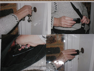
 Product: Key Holder. (Product that incases numerous keys that can slide out to be used.)
Target Market: 40-50 year old women.
Thursday, August 21, 2008
Week 4 Video Reflection: Yves Behar
If designers are able to use the idea of telling stories through design or creating objects that tell a story, could lead to really inquisitive designs. This would start a whole, new thinking between designers, and lead design in a new way, making it more humanistic. As Yves Behar says, “designers need to bring a different, humanistic relation between the two (the product and consumer),” this would make easier to use and more friendly designs available.
Museum Tour.

The first image, is that of a revolutionary car design, it was inspired by a tear or water drop, and changed they ways of car design for many years.
The drawing is that of a puzzle inspired design tea and coffee set, I found this piece extremerly interesting, as I personally don't see a need or point for design's such as this, however, it has made me think differently about the way pieces can be designed to create interest, as it did with me.
In the ecological section of the museum, I did find the re-house as it made it much more apart that houses can be made from recycable material, and still look exactly the same and function the same, however having less impact on the environment. I dont have a drawing from this as it wasn't that much different from your average kitchen.


Wednesday, August 13, 2008
Video Reflection: Organic Design.
I found the video Organic Design from "Ross Lovegrove" extremerly interesting and informative. It has helped me to understand a new way to think about design, and in some cases the simplicitly that can create such a unique design. The bottle that Lovegrove designed in based on such a simple form, which directly relates to the product itself, and it is this type of thinking that needs to be pursued to create new and unique products.
Thursday, August 7, 2008
Task 5: Video
The days of designing and creating products just based on asethetics seem to be over. As the video "David Kelley 2002 -The future of design is human centred.” demonstrates, it is becoming much more apparent that design needs to be focused in the relation between product and the consumer. Products in today's world need to have new focus in there design, they do need to continue to use the aesthetics and technology that has allowed them to reach the point they have thus far, but they need to have a new approach taken in the design process, with a focus on producing products that are human centred.
After watching the video, it has been made clear that human centred design has been available for a while, although with advances in todays technologies, designers are at the point were they are able to re-channel were design is to be taken, and change its direction for the future. The future needing to be human centred.
After watching the video, it has been made clear that human centred design has been available for a while, although with advances in todays technologies, designers are at the point were they are able to re-channel were design is to be taken, and change its direction for the future. The future needing to be human centred.
Wednesday, August 6, 2008

Subscribe to:
Posts (Atom)